The project
It had been over three years since the last refresh of the Shffld site, so it was about time that got sorted. There was a lot to do, from technical, visual, content, accessibility and performance points of view.
Our aims
- Refresh the design and logo style
- Reconsider fontface
- Check and update colour palette
- Update Eleventy and all plugins to newest versions
- Refresh/update stale content
- Add case studies collection page
- Add articles and article collections
- Reduce page weight where possible
- Maintain or improve Core Web Vitals scores
Re-branding
I wanted to keep a lot of the same general colours and some of the feel of the previous version, but with a bolder, friendlier font and style added. I'd wanted to add articles for a considerable amount of time, but had never gotten around to writing enough of them, nor implementing the functionality needed.
Accessibility and performance are always high priorities for me, and the Shffld site is no different. The previous version scored very highly on Google's Page Speed Insights (Core Web Vitals metrics), and I wanted to ensure that no matter what I changed or removed or added, that the scores remained at least as good as they were - or ideally better.
My first port of call was to look into how the logo could feel a bit more friendly and approachable. I loved the old logo, but it felt like time to simplify a little bit and make it feel a bit more 'happy'. I landed in the end on something a bit bolder and curvier, but something I could still easily use in pretty much any colour combination.


I also wanted to replace Source Sans 3 with something a bit bolder, curvier and friendlier too. After a lot of deliberation I settled on Rubik.


Colour palettes
The original palette
-
- Raspberry
- #e70075
- rgb(231 0 117)
- hsl(330deg 100% 45%)
-
- Raspberry (text)
- #ff0081
- rgb(255 0 129)
- hsl(330deg 100% 50%)
-
- Claret
- #6a1c39
- rgb(106 28 57)
- hsl(338deg 58% 26%)
-
- Darkness
- #171717
- rgb(23 23 23)
- hsl(0deg 0% 9%)
-
- Mineshaft
- #313131
- rgb(49 49 49)
- hsl(0deg 0% 19%)
-
- Silver
- #c1c1c1
- rgb(193 193 193)
- hsl(0deg 0% 76%)
-
- White-ish
- #f5f5f5
- rgb(245 245 245)
- hsl(0deg 0% 96%)
With WCAG 3 on the distant horizon, it felt like a reasonable time to check my existing colour palette against the new APCA colour contrast method to make sure things were as accessible as possible.
With that in mind, and after a little bit of testing, I landed on a reduced palette with a bit of a different look and feel.
The refreshed palette
-
- Deep pink
- #c20071
- rgb(194 0 113)
- hsl(325deg 100% 38%)
-
- Rubber Duck
- #ffe600
- rgb(255 230 0)
- hsl(54deg 100% 50%)
-
- Cyan
- #00ffff
- rgb(0 255 255)
- hsl(180deg 100% 50%)
-
- Black
- #000
- rgb(0 0 0)
- hsl(0deg 0% 0%)
-
- Grey
- #545454
- rgb(84 84 84)
- hsl(0deg 0% 33%)
-
- Light Grey
- #a8a8a8
- rgb(168 168 168)
- hsl(0deg 0% 66%)
-
- White
- #fff
- rgb(255 255 255)
- hsl(0deg 100% 100%)
Colour contrast
On the accessibility side of things, I needed to ensure that all colour combinations likely to be used met both old and new standards the best I could. This means at least AA standard for WCAG 2 (but ideally AAA standard where possible), and at least Lc70/Lc-70 for WCAG 3.
-
- White/Deep pink
- Lc -82.5 / AA 5.95
-
- Deep Pink/White
- Lc -77.2 / AA 5.95
-
- Rubber Duck/Black
- Lc -90.9 / AAA 16.57
-
- Black/Rubber Duck
- Lc 90.6 / AAA 16.57
-
- Black/White
- Lc 106 / AAA 21
-
- White/Black
- Lc -107 / AAA 21
-
- Cyan/Black
- Lc -92.2 / AAA 16.75
-
- Black/Cyan
- Lc 91.8 / AAA 16.75
The worst colour contrast by APCA checks is Deep pink on White at Lc-77.2, but this is acceptable for general text that is at least font-weight: 600 and font-size: 16px. In most places, the deep pink on white combo is only used for large, semi-bold or 'black' font-weight titles.
It is used for links in some places, but all that text is 28px and on mobile it's 20px as standard so should hit all the right contrast numbers to pass on the APCA checks.
There is one combination of this colour palette I just can't use anywhere though: the Deep Pink and Black combination.
-
- Black on Deep pink
- Lc 26.9 / AA+ 3.53
-
- Deep Pink on Black
- Lc -24.6 / AA+ 3.53
EightShapes made a nice handy contrast grid that will show you all the passing combinations in a colour palette (but currently it only shows WCAG2 AA to AAA standards).
Behind the scenes, I upgrade the Static Site Generator (SSG) - Eleventy - to the latest version and made sure all Eleventy and PostCSS plugins were up-to-date too. This is essential maintenance from a security perspective, but also deprecates some features, and occasionally brings new features to the table.
New and refreshed content
I went through each page of the site and removed outdated information, and updated where possible. I also added new sections to the site for functionality I'd wanted for a long time. I added a landing page for the case studies I'd already written, and a new articles area where I could post all manner of front end/web longform articles.
This also added pagination, tagging and collections to the site so articles can be filtered into areas such as just accessibility or performance.
Performance
I made a huge effort on the performance front in this refresh, knocking a decent chunk off page weight and making sure that my Core Web Vitals metrics stayed in good (amazing!) shape, while managing to add more functionality in the process too.
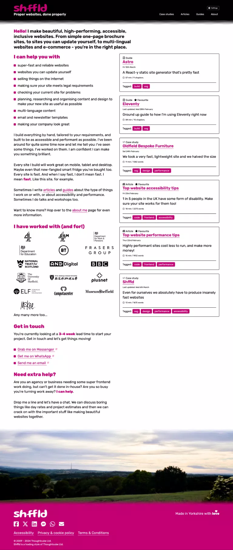
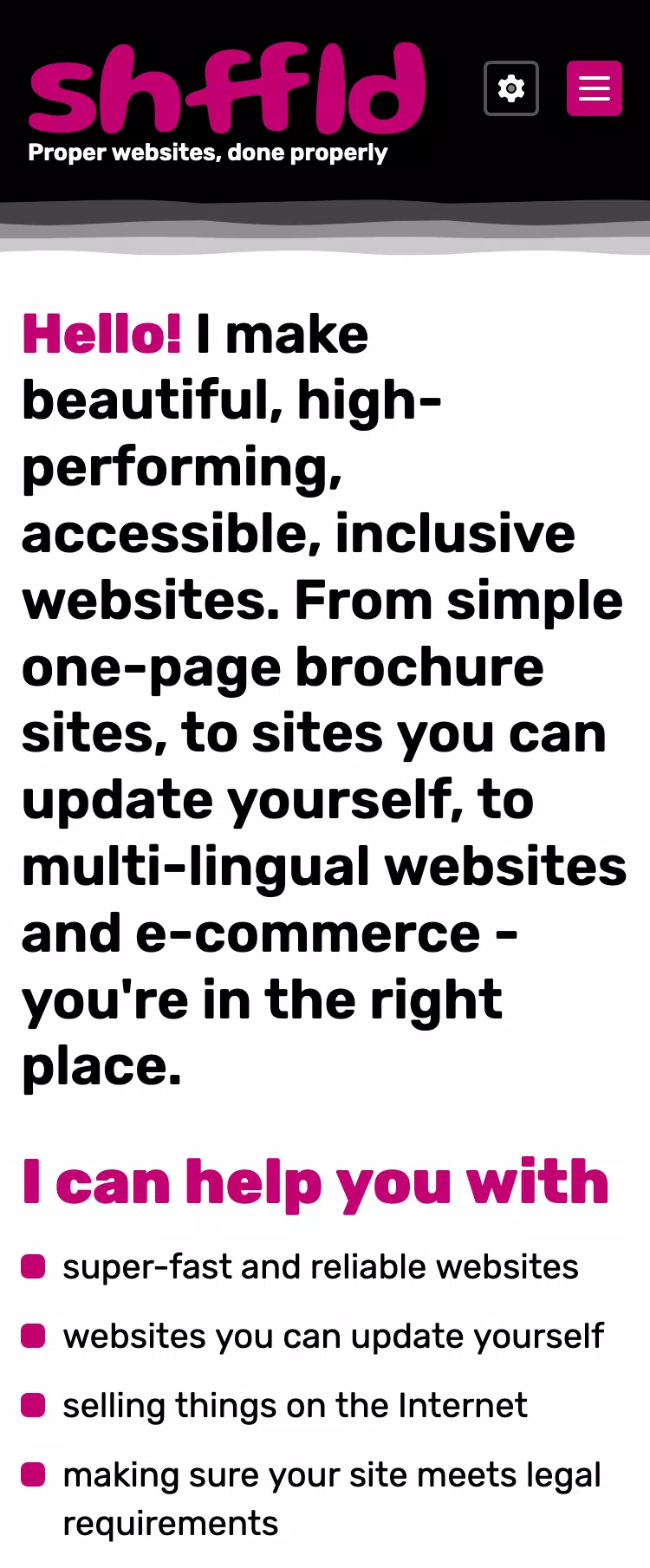
I trimmed down the main header area to make it a bit more 'traditional' since I now needed some space to add a main navigation due to the new sections of the site. I decided to keep a very similar 'brushed' feel to it, but reduced overall size by about 75%.
With the new sections of the site, it also meant that I could do recent/featured articles easily on the homepage too to call out content I want to lead people to.
Colour themes
The old site had a colour theme switcher so you could choose between light and dark themes, and your preference would be stored in your browser's localStorage so it would load the right theme if you visited again.
I wanted to expand on that and add a high contrast light and high contrast dark theme to the list as well. While there are ways to do this in CSS via exposed system settings, using @media queries, I decided to opt for a simpler approach (at least for now!) and just allow the switching by user input. This was mainly to keep the page weight lower, but it's something I can look into in the next revision.
@media (prefers-color-scheme: dark) { ... }
@media (prefers-color-scheme: light) { ... }
@media (prefers-contrast: more) { ... }
After a number of rounds of refinements, many areas of the style were tweaked, including updating the grungy dividers to something a bit more in keeping with the new style of the site.
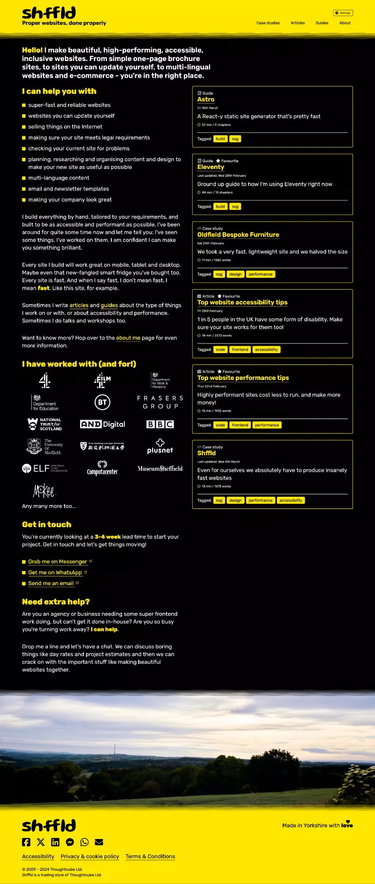
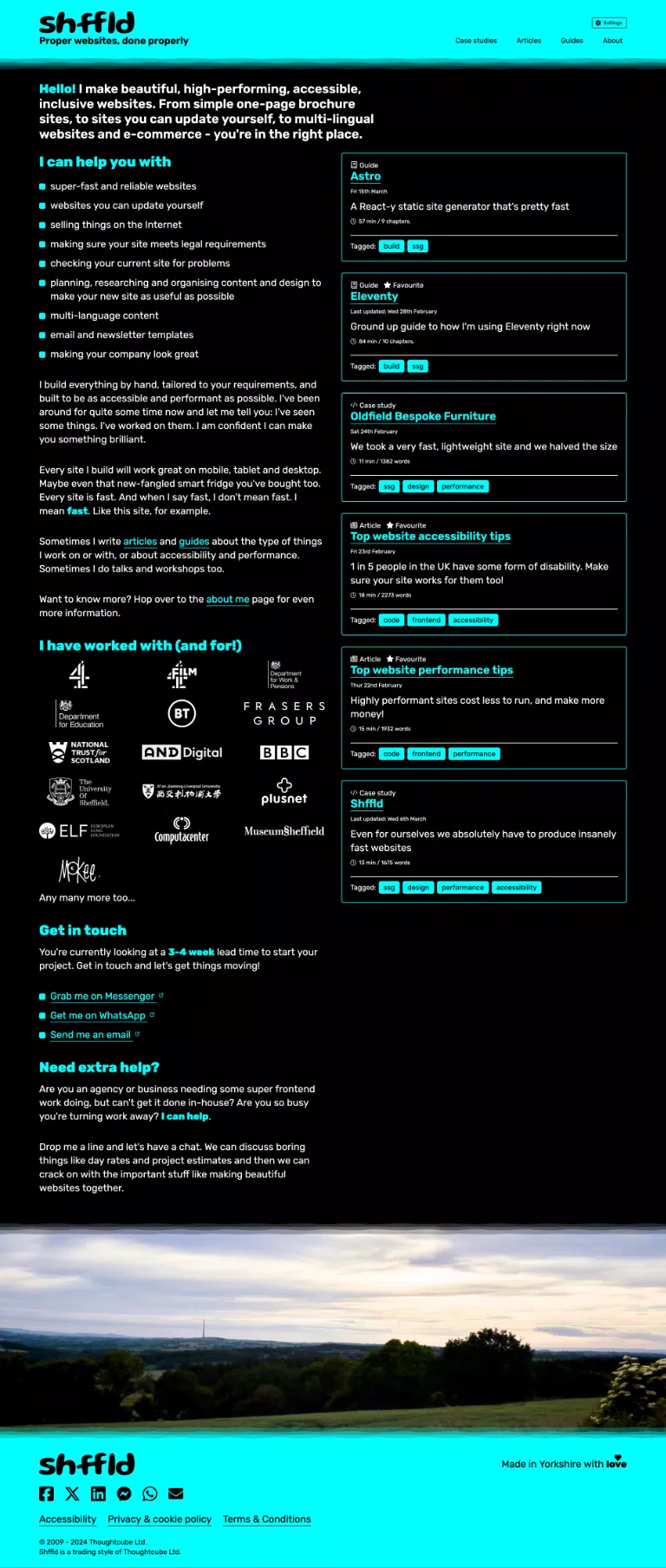
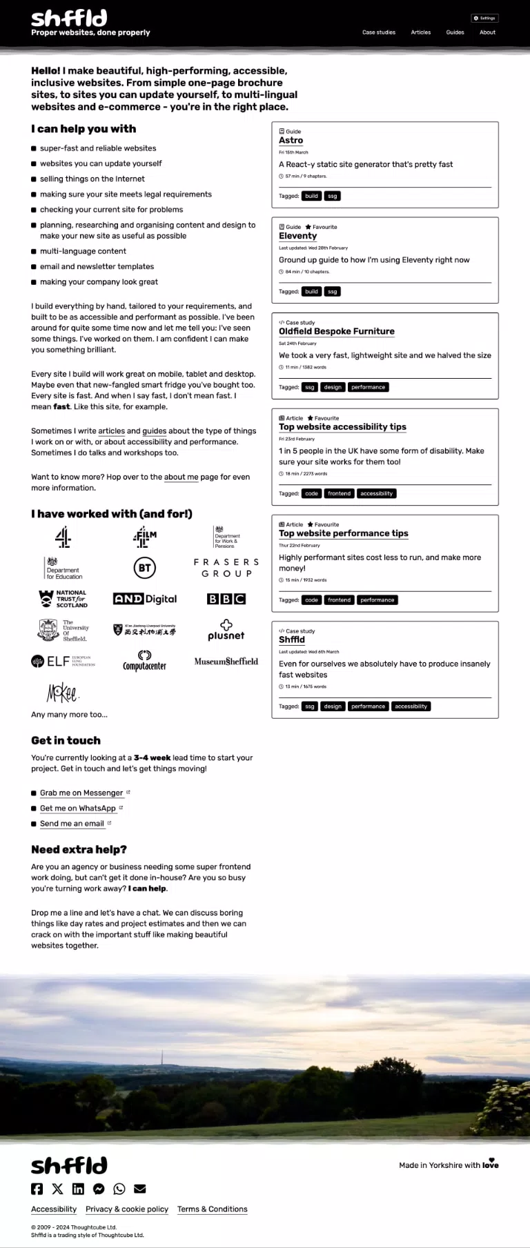
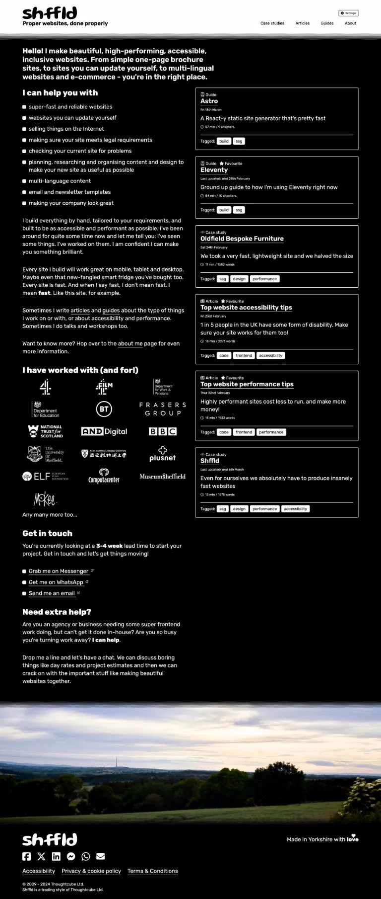
I added several new 'pattern' styles: calm waves (default), multiple waves, single wave, peaks, multiple peaks, lines, steps, and wobblies.
Core Web Vitals (May 2024)
Mobile
-
Largest Contentful Paint:
1.2s
Success: < 2.5s Warning: 2.6s - 4s Error: > 4s
-
First Contentful Paint:
0.9s
Success: < 1.8s Warning: 1.81s - 3s Error: > 3s
-
Speed Index:
2.7s
Success: <3.4s Warning: 3.5s - 5.8s Error: > 5.8s
-
Cumulative Layout Shift:
0
Success: < 0.1 Warning: 0.11 - 0.25 Error: > 0.25
-
Total Blocking Time:
0ms
Success: < 200ms Warning: 201ms - 600ms Error: > 600ms
-
Page weight:
436 KB
Success: < 1.5 MB Warning: 1.5 MB - 2.23 MB Error: > 2.23 MB
-
Performance: 100%Accessibility: 100%Best practices: 100%Search Engine Optimisation: 100%
Desktop
-
Largest Contentful Paint:
0.3s
Success: < 2.5s Warning: 2.6s - 4s Error: > 4s
-
First Contentful Paint:
0.2s
Success: < 1.8s Warning: 1.81s - 3s Error: > 3s
-
Speed Index:
0.9s
Success: <3.4s Warning: 3.5s - 5.8s Error: > 5.8s
-
Cumulative Layout Shift:
0
Success: < 0.1 Warning: 0.11 - 0.25 Error: > 0.25
-
Total Blocking Time:
0ms
Success: < 200ms Warning: 201ms - 600ms Error: > 600ms
-
Page weight:
436 KB
Success: < 1.5 MB Warning: 1.5 MB - 2.23 MB Error: > 2.23 MB
-
Performance: 100%Accessibility: 100%Best practices: 100%Search Engine Optimisation: 100%
Tech used
- Eleventy: static site generator
- PostCSS: for CSS niceties
- Gulp: For front end build tasks
- Continuous Integration/Continuous Deployment (CI/CD) to Vercel
Proper loveleh
Not gonna lie, I'm pretty chuffed with this site what I did build myself. It's been tough, but I rallied the troops, and I pushed it over the line in the end. It's proper reyt, I tell thee.Phil Steer It's me!
It's been a long time coming, and I'm really happy with the progress so far. There's already a decent selection of articles and I plan to keep on adding as soon as I can. Refreshing the content has meant that it feels a bit more relaxed and casual but the design refresh helps to keep it feeling professional but confident and friendly.
Are you still here?
You've got staying power, that's for sure! Does your website say the same about you? Do you want a website that shows people you really mean business? Of course you do! I can help.