Accessibility
isn't
optional
About 16% of the world's population have some form of disabilityWorld Health Organisation
There are at least
1.3
billion
people with disabilities
More than
1
in
5
people in the UK have a disability
In the UK there are over
15.5
million
people with disabilities
Accessibility is not just about people with
visual impairments
There are
many
types of disability
Visual
Neurological
Auditory
Cognitive
Learning
Physical
Speech
Not all disabilities are
visible
Some disabilities are
temporary
Almost everyone
will experience some form of disability during their life
King Arthur versus the Black Knight from Monty Python and the Holy Grail. The Black Knight is missing both his arms.
Even if it is just a flesh wound
What do we
mean
by accessibility?
Make
everything
we build usable by
as many people
as possible
The power of the web is in its universality. Access by everyone regardless of disability is an essential aspect.Sir Tim Berners-Lee (Actually invented the Internet)
A person (a “service-provider”) concerned with the provision of a service to the public or a section of the public (for payment or not) must not discriminate against a person requiring the service by not providing the person with the service.Equality Act 2010 (Boring legalese)
It is a
legal
requirement
YOU
GOT
NO
CHOICE
Yes!
Even if you're a local council
Yes!
Even if you're a publicly-funded charity
Yes!
Even if you're a school (partially)
40%
of UK council websites are inaccessible
It's the law, innit.
- Previously: Disability Discrimination Act 1995
- Now: Equality Act 2010 and Public Sector Bodies (Websites and Mobile Applications) (No. 2) Accessibility Regulations 2018.
- US: Section 508 amendment of the Rehabilitation Act 1973 (1998), the Americans with Disabilities Act (ADA) (1990/2009), and others.
- Australia: Disability Discrimination Act (1992)
- EU: Web and Mobile Accessibility Directive (2016) and the European Accessibility Act (draft proposal, expected 2025)
- Lots of other countries too, including: Canada, France, Germany, India, New Zealand
YOU
COULD
GET
SUED
£274
billion
The total spending power of families with at least 1 disabled person
£400
billion
Total spending per year
YOU
ARE
LOSING
MONEY
You might not think it's
your
problem
IT
IS
YOUR
PROBLEM
Accessibility is
EVERYBODY'S
problem
Accessibility benefits
EVERYBODY
Everything
we create is easier for
everybody
to use
It's the
right
thing
to do
It makes you
look
good
Accessibility should
never
be an afterthought
Over
95%
of sites failed basic WCAG2 automated tests
Number of errors increased
13.6%
compared to last year
This makes me
sad
Doctor Who portrayed by David Tennant looking very sad in the rain.
How
do we make things better?
WAI ARIA
- Stands for Web Accessibility Initiative - Accessible Rich Internet Applications.
- Helps us build dynamic content that will work well with assistive technology such as screen readers.
- It’s mostly just a bunch of attributes we add to HTML elements as developers.
- Using the wrong attributes can make things worse than not using them at all!
- You don’t need to put them on everything
WCAG 2
- Stands for Web Content Accessibility Guidelines 2(.x)
- Current version is 2.2
- Criteria is a simple pass or fail
- WCAG 2 uses A, AA, and AAA 'levels'
- Hard to follow
- It’s quite old now - first published the same year the first iPhone was released!
- Doesn’t reflect how people use the Internet any more
WCAG 3
- The acronym is the same, but the name is slightly different
- Stands for W3C Accessibility Guidelines 3
- WCAG 3 is coming “soon”
- Designed to cover more types of access needs
- Designed to be flexible so it can change with the times
- Designed to be easier to understand
WCAG 3
- Different conformance levels: ’Bronze’, ‘Silver’ and ‘Gold’
- You will have to test with assistive tech, ideally with people with disabilities to achieve the highest conformance levels
- A new way to check colour contrast!
Incredibly common
(but very easy to fix)
mistakes
The golden rule of
FONT SIZE
If it looks
small
It's probably already
too small
Don't put
text
over
images
if possible.
Please don't.
Ever.
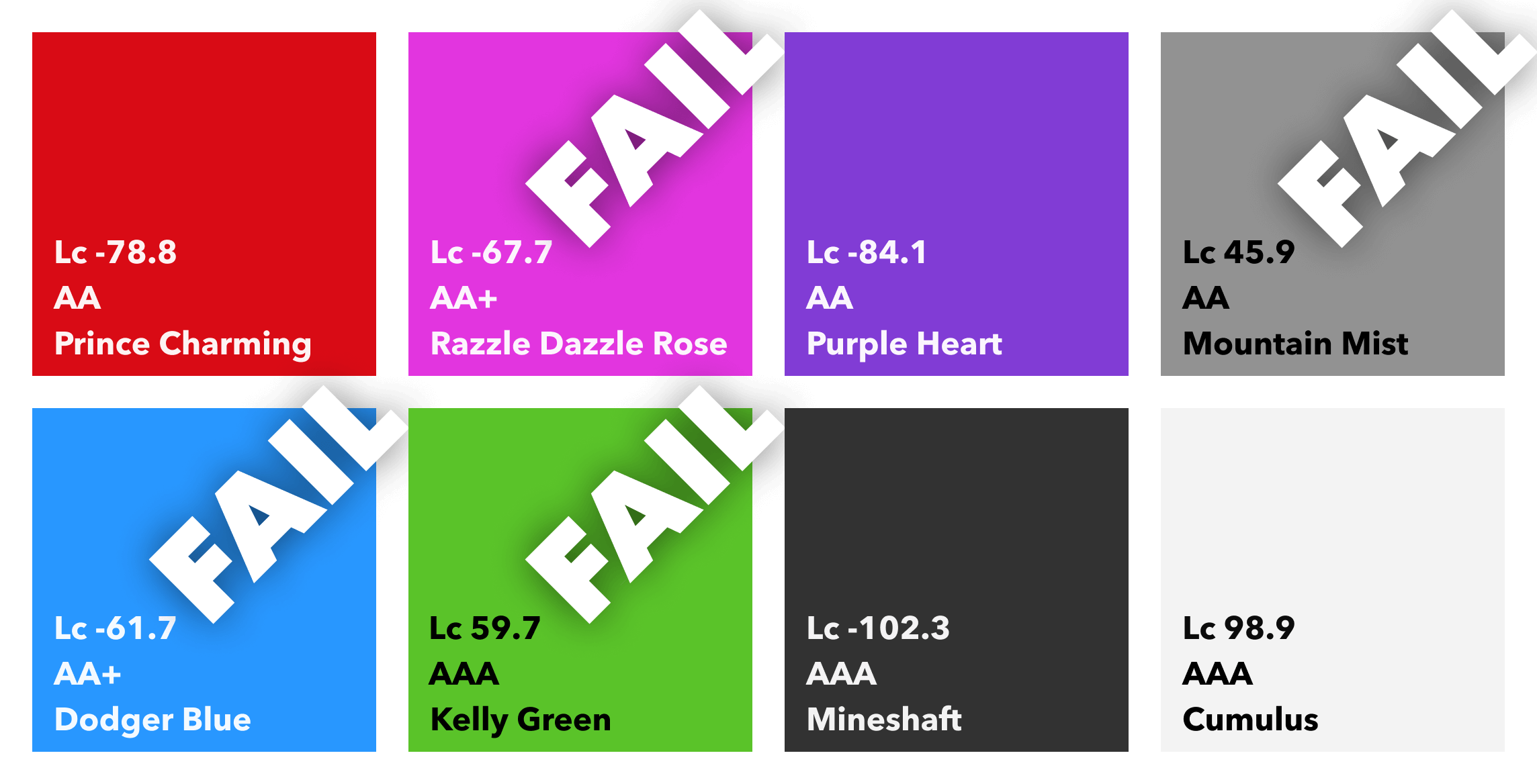
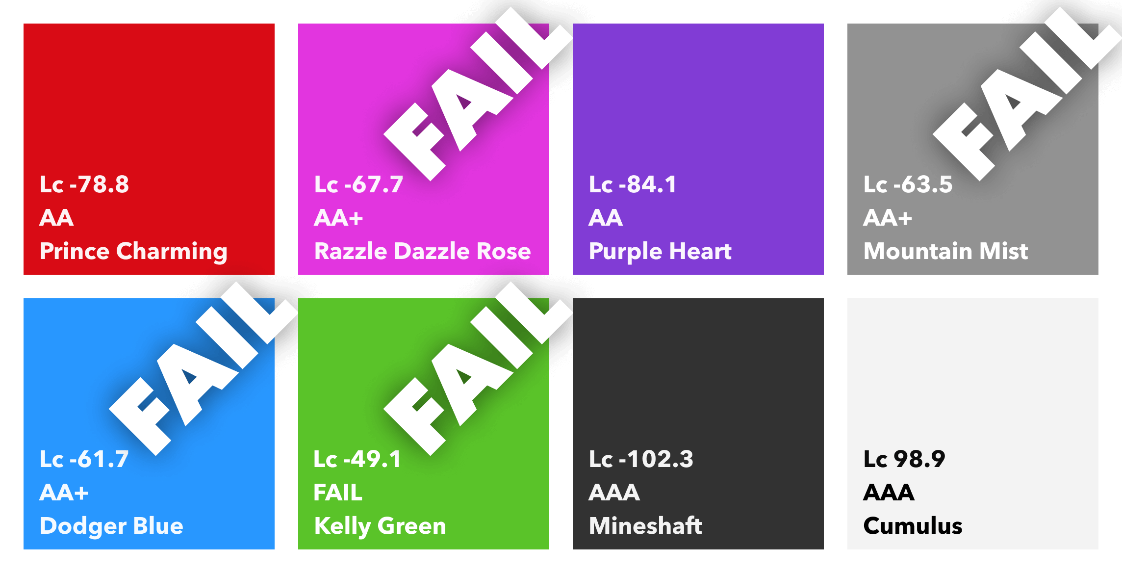
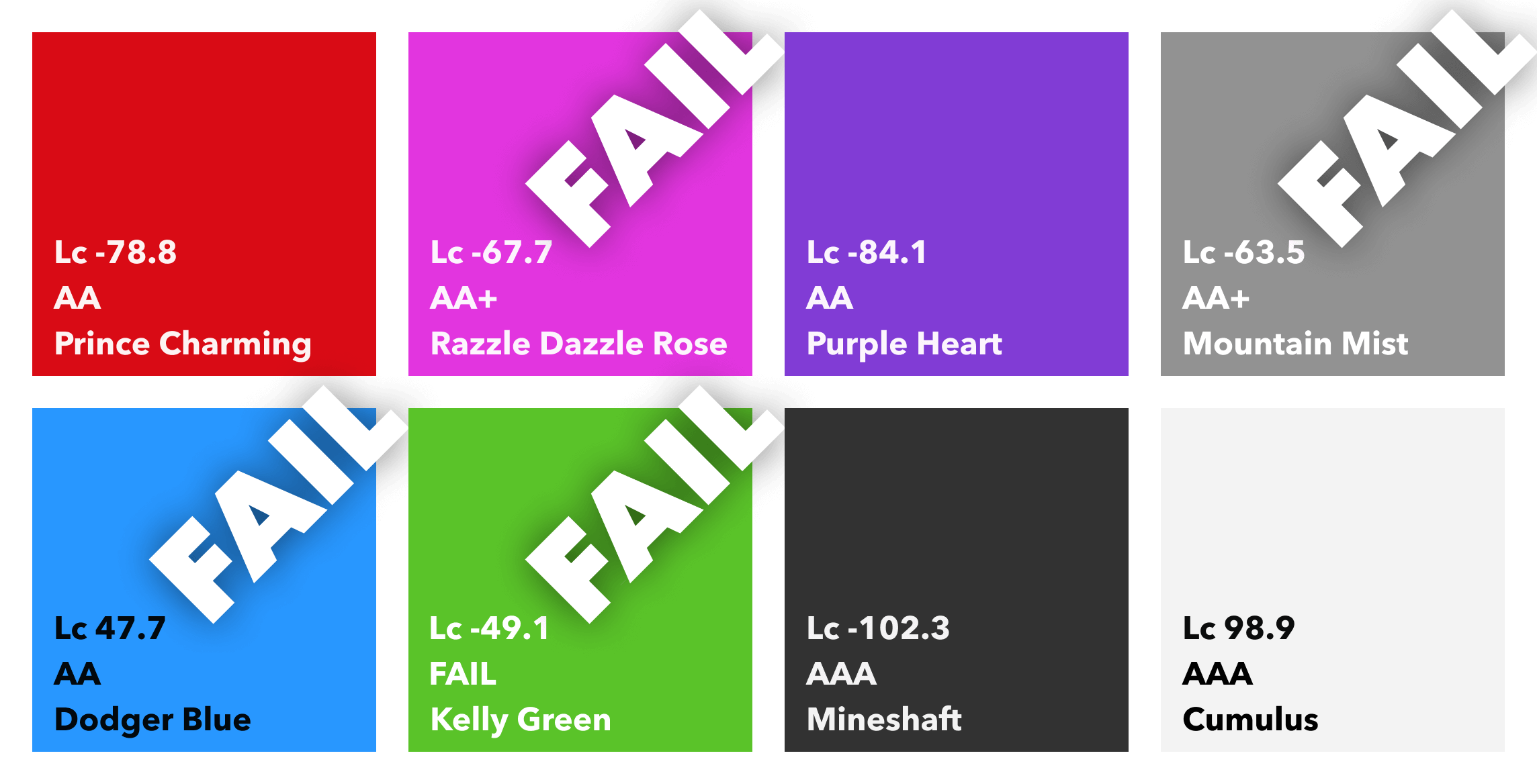
It’s important to have enough colour contrast between elements.
Low contrast
can render
content practically
invisible to
users.
Colour contrast is the most common WCAG
FAIL
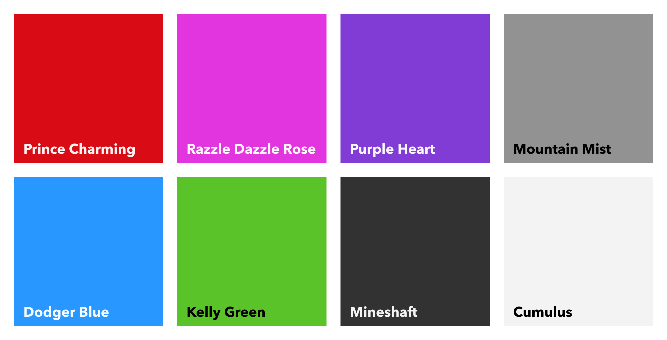
Pop quiz:
Which of these
colour combinations
are accessible?
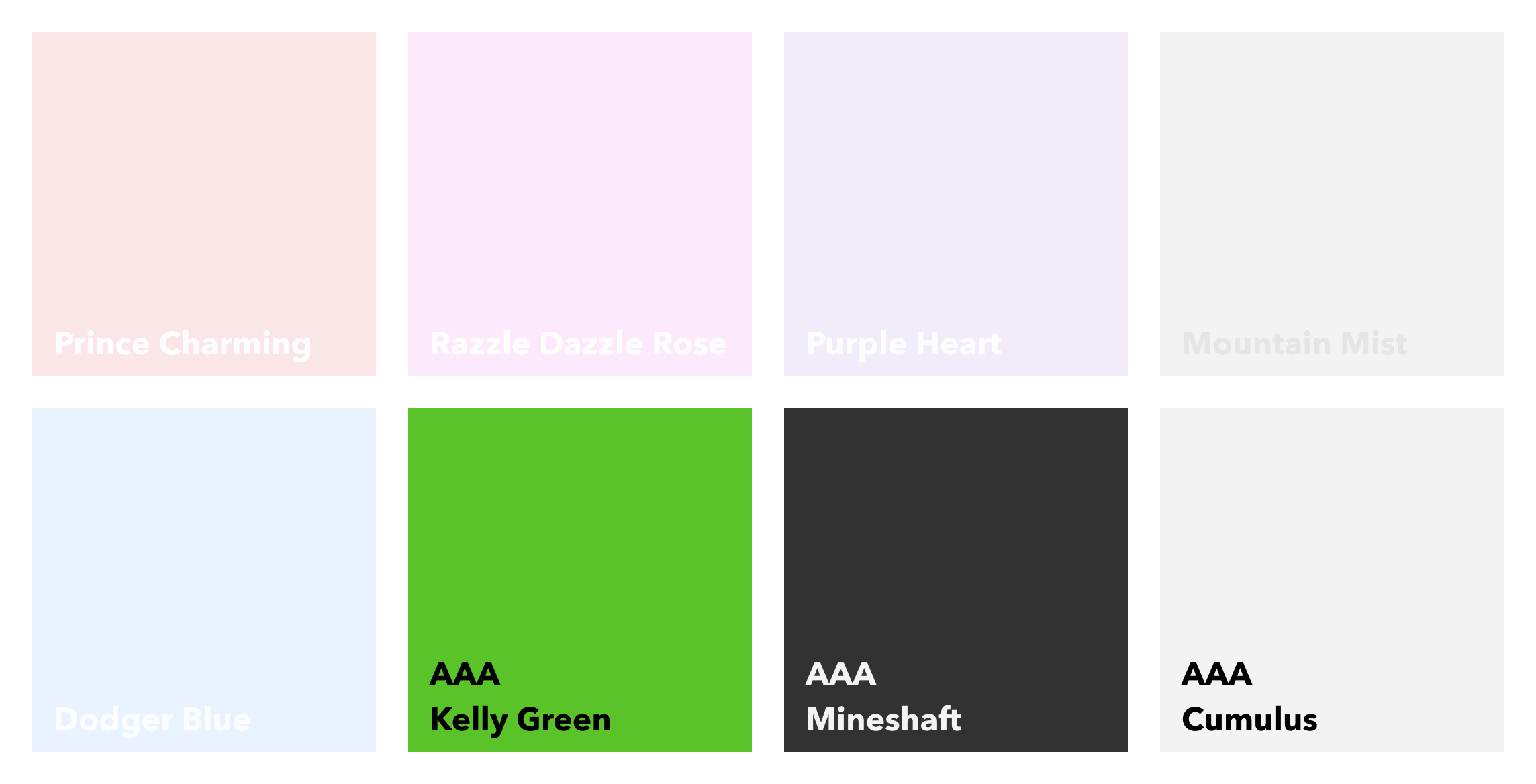
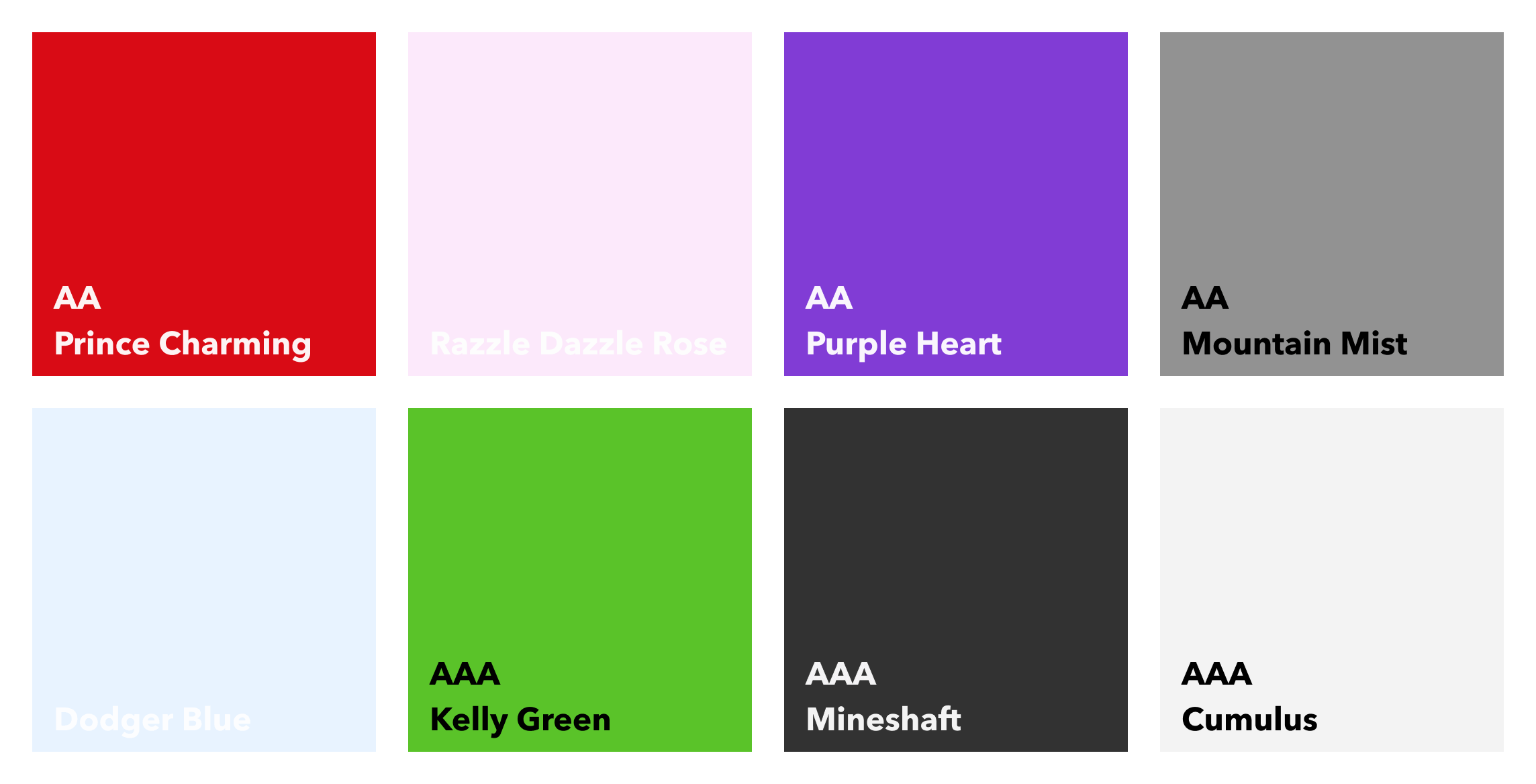
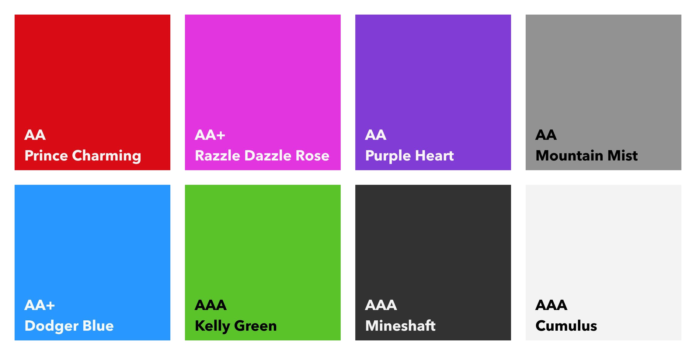
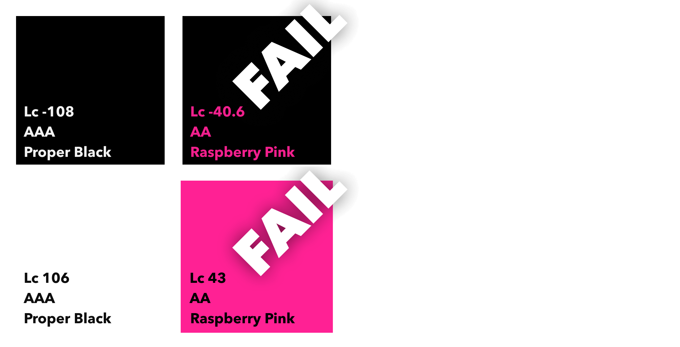
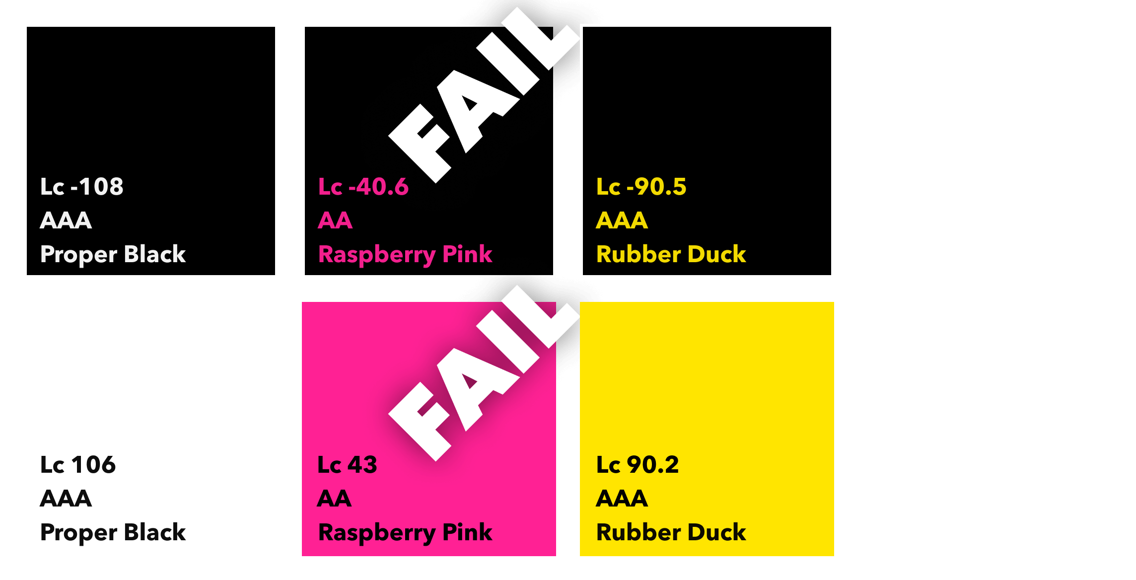
APCA
- Stands for Advanced Perceptual Contrast Algorithm and WCAG 3 will use this new colour contrast method
- Instead of contrast ratios, it will use a different scoring system called Lightness contrast (Lc)
- 0 to 106 for dark text on light backgrounds
- 0 to -108 for light text on dark background
- Some combinations previously deemed inaccessible are actually now accessible!
- The font weight is considered as well as the font size
APCA
- There’s more ‘passable’ levels to think about
- Checkers tend to test with common sans-serif fonts
- If you use funky fonts, you can’t be sure you’re using accessible combinations with an automated APCA colour checker
- Light on dark and dark on light DO NOT give the same outcome!
- It’s actually both better and worse
- It’s quite confusing
- SCIENCE!
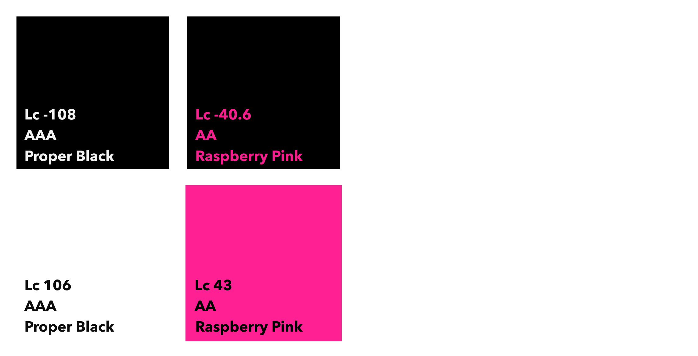
Charlie Sheen is a rockstar from Mars. And he's winning.
This colour scheme is
inaccessibile
under APCA contrast checks
This colour scheme is
accessibile
under APCA contrast checks
There are an estimated
2.2
billion
people with a near or distant vision impairment
There are an estimated
300
million
people with colour vision deficiency
Prepare for
eye
puke
Normal
Many people will struggle to see this
Deuteranopia
Many people will struggle to see this
Deuteranomaly
Many people will struggle to see this
Protanopia
Many people will struggle to see this
Protanomaly
Many people will struggle to see this
Tritanopia
Many people will struggle to see this
Tritanomaly
Many people will struggle to see this
Monochromacy
Many people will struggle to see this
Partial Monochromacy
Many people will struggle to see this
What about a
sensible
example?
Normal
Most people will be able to see this
WCAG2: AA+ 3.76:1
WCAG3: Lc -66.5
WCAG3: Lc -66.5
Deuteranopia
Most people will be able to see this
WCAG2: AA 5.17:1
WCAG3: Lc -80.7
WCAG3: Lc -80.7
Deuteranomaly
Most people will be able to see this
WCAG2: AA 4.97:1
WCAG3: Lc -79.0
WCAG3: Lc -79.0
Protanopia
Most people will be able to see this
WCAG2: AA 5.31:1
WCAG3: Lc -81.4
WCAG3: Lc -81.4
Protanomaly
Most people will be able to see this
WCAG2: AA 5.27:1
WCAG3: Lc -80.7
WCAG3: Lc -80.7
Tritanopia
Most people will be able to see this
WCAG2: AA+ 4.08:1
WCAG3: Lc -70.3
WCAG3: Lc -70.3
Tritanomaly
Most people will be able to see this
WCAG2: AA+ 4.04:1
WCAG3: Lc -69.9
WCAG3: Lc -69.9
Monochromacy
Most people will be able to see this
WCAG2: AAA 7.01:1
WCAG3: Lc -89.2
WCAG3: Lc -89.2
Partial Monochromacy
Most people will be able to see this
WCAG2: AA 7.19:1
WCAG3: Lc -89.1
WCAG3: Lc -89.1
YOU
ARE
LOSING
MONEY
It is a
legal
requirement
Heading and Content structure
- Content should be in a logical order
- Headings should be in the correct order, starting with a <h1>
- For screen readers’ sake, each page should only have a single <h1> element
- Every page should contain a <title> and it should be unique
- Browser extensions can help with the document outline
- Every page should have a lang attribute to tell the browser what language the page is written in
Pop quiz:
How does a screen reader read
English
content it thinks is
Czech?
Most people today can hardly conceive of life without the Internet. Some have argued that no other single invention has been more revolutionary since Gutenberg’s printing press in the 1400s.
Now, at the click of a mouse, the world can be “at your fingertips”—that is, if you can use a mouse... and see the screen... and hear the audio. In other words, if you don't have a disability of any kind.
Images
- The first question you should ask is: “Is this part of the content, or part of the design?”
- If it’s part of the content, is it purely decorative or does it add to the content of the page?
- If it’s part of the design, it should probably be added in CSS as a background image
- If it’s purely decorative and cannot be added in CSS as part of the design then it should be added as an <img> with an empty alt attribute so that screen readers don’t announce it.
- If it’s part of the content and it adds to the experience, give it some alt text, and make it descriptive and understandable
Pop quiz:
Which of these image descriptions makes the
most
sense?
<img src="the-badger-pen-logo.svg" alt=
"This is an image of my company logo"
width="200" height="100">
<img src="the-badger-pen-logo.svg" alt=
"The logo of The Badger Pen, an awesome company based in Yorkshire. This is an SVG which is nice for icons and logos, yes!"
width="200" height="100">
<img src="the-badger-pen-logo.svg" alt=
"The Badger Pen"
width="200" height="100">
<img src="the-badger-pen-logo.svg" alt=
"Company logo"
width="200" height="100">
<img src="the-badger-pen-logo.svg" alt=
" "
width="200" height="100">
Audio and video elements
- All modern browsers support HTML5 video
- You should provide written transcripts of audio files
- You should provide subtitles (the basics) or Closed Captions (the best) and written transcripts for videos
- Avoid autoplay if you can!
- ALWAYS provide player controls. No exceptions
Semantic elements
- HTML5 introduced elements with inherent ‘roles’, which makes it easier to work out when they should be used, e.g.: <header>, <footer>, <main>, <aside>, <nav>
- Many mistakes developers make with regards to accessibility stem from using the wrong element in any given situation
- No excuses not to use them
When do I use which element?!
- Are you clicking something? It's probably a <button>
- Does it go somewhere? It's probably an <a>
- Is it a menu? Put it in a <nav>
- Is it a date or time? Put it in a <time>
- Is it the content for the page? It's going to need to be somewhere inside a <main> element and most likely inside an <article>
- Is it the header or footer of a page? Put it in a <header> or a <footer>. Obviously
Text content
- People don’t read properly on the Internet - most scan for the specific information they need
- Keep your content concise, mostly*
- Be direct
- Many smaller paragraphs and sections instead of fewer, larger blocks of text
- Lists are easier to read
- Keep your language as simple as possible
Text content
- Try to emphasise key points
- STOP SHOUTING! Uppercase is harder to read for at least low vision and dyslexic users
- Less clutter, more breathing room
- Don’t use text sizes that are too small
- Don’t use made up words if you can help it, because that’s just outright fupid
English is
NOT
everybody's native language
There are around
800
million
people with dyslexia
There is up to
480
million
people with dyscalculia
There are over
366
million
people with ADHD
In the UK there are around
1.5
million
people with learning disabilities
There are around
200
million
people with an intellectual disability on this planet
Links
- Internal links should generally never open in a new window*
- External links that open in a new window should be clearly labelled for screen reader users
- If possible, make external links easily distinguishable from internal links, or links to file downloads
- Use link text that clearly signposts where a user will be taken if they click it.
- Do not just put an image in a link and expect it to make sense
Pop quiz:
Which of these links makes the most sense
without
context?
For more information
click here
.
Click here to read more about what we do
.
Aren’t we interesting? You can find out more about
how we work
if you want to.
Aren’t we interesting? You can
find out more
about
how we work
if you want to.
Vestibular motion disorders can be
triggered
by
excessive
movement on screen
We can
automatically
reduce motion and animations
Some users struggle with
bright colour schemes
or
low contrast
It is possible to check if someone has
enabled
settings on their device
And write website styles to allow for
each requirement
Isn't there an
easier
way to do this?
Use an
accessibility overlay
A
what
now?!!!?!!!
What is an overlay?
- A JavaScript widget that offers accessibility options
- Allows for ‘easy’ adjusting of font size, colour contrast
- Pausing of animations/GIFs
- Auto-filling image alt attributes
Why do people use overlays?
- Simple to set up
- Don’t need to do any real work
- Don’t want to pay someone to do it properly
- Don’t have the time to make it right
- Don’t have the necessary knowledge and skills
Overlays promise...
- to make your site accessible without having to change any underlying code
- to make your site WCAG compliant
- to resolve accessibility issues instantly
A Bob Ross parody blowing a chef's kiss.
Sounds
PERFECT
RIGHT?
NOPE.
ACCESSIBILITY
OVERLAYS
ARE
NOT
ACCESSIBLE
The truth is...
- they often don’t work well on mobile
- they do not fix fundamental user experience issues
- they conflict with users’ assistive tech
- they load late
- you’re still getting sued
Accessibility overlays
DO NOT
change the
UNDERLYING CODE
They might not do
ANYTHING
at all
Captain Jean-Luc Picard with his head in his hands.
ACCESSIBILITY
OVERLAYS
ARE
NOT
ACCESSIBLE
An
accessibility expert
calls out an
accessibility overlay company
for making an
inaccessibile product
Accessibility overlay company
sues
the accessibility expert
Nobody
profits
STOP
BEING
SLACKERS
Principal Strickland from Back to the Future looking disappointed.
Out there in the
real world
Inaccessibility cost $6 million in class action lawsuit in 2005.
Their newly-launched site was LESS accessible than the version it replaced
An archer failing to arch, thus failing to hit the target completely.
In 2012 the National Association of the Deaf brought a law suit against Netflix for failing to provide subtitles for its content.
Netflix content is nearly all subtitled these days.
The National Association of the Deaf (NAD) filed a federal class-action lawsuit in 2015.
Both settled by consent decrees, but Harvard also had to pay over $1.5M in costs.
In 2017 Nike were sued for nike.com and converse.com for preventing visually impaired users shopping on their sites without assistance.
DIDN’T DO IT.
Domino’s have had lawsuits brought against them for failing to make their sites accessible enough.
You could say they were missing out on a pizza the action.
Other notable
slackers
- Amazon
- Fox News Network
- Burger King
- Barnes & Noble Booksellers
- Five Guys Burgers and Fries
- Peloton Interactive (fitness thingamibob)
- The New York Times
- Adidas (America)
- Home Depot
- Warner Bros Entertainment, inc. (for the Harry Potter Store)
Beyonce and her Single Ladies expecting that somebody probably should do the right thing and claim their lady as their bride.
If you like it then you shoulda put accessibility on it
Yeah yeah, OK.
I get it...
But it sounds like a lot of
hard work
Butthead head-butting Beavis.
IT
IS
YOUR
JOB
It is a
legal
requirement
YOU
WILL
GET
SUED
YOU
ARE
LOSING
MONEY
The basics of accessibility are
not difficult
1. Don't sign off
cluttered
stuff
2. Follow
text content
best practice
3. Ensure
colour contrast
meets standards
4. Make sure
font sizes
are big enough
5. Challenge if you have any
concerns
6. This applies to more than just
websites
This applies to print, video, audio, apps, and even slide decks
And...
Deloris Wilson (A.K.A Sister Mary Clarence) dancing during a choir performance of Oh Happy Day.
Preach it, sister!
There are at least
1.3
billion
people with disabilities
IT
IS
YOUR
JOB
It is a
legal
requirement
YOU
GOT
NO
CHOICE
YOU
WILL
GET
SUED
YOU
ARE
LOSING
MONEY
Dwight Schrute from the American version of The Office screaming.