The project
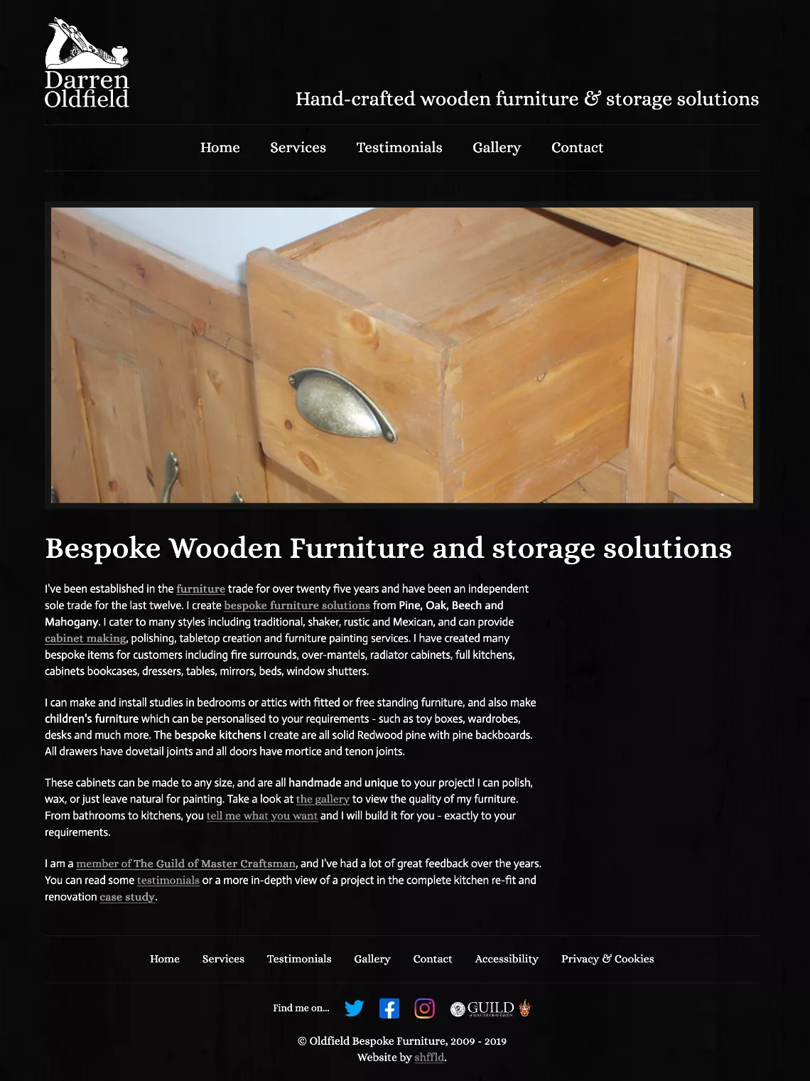
It was time to look at where we could improve again, as it had been about 2 years since our last performance and technology updates to the site. It's really important with any site that you ensure you periodically update plugins, libraries and applications you use to build and run it.
Static sites are no exception - they just have less security concerns because there's no database sitting behind it, and no public area to log in to worry about.
Our aims
- Keep the same general look and feel
- Reconsider fontface usage
- Update CSS to modern layout techniques
- Update Eleventy and all plugins to newest versions
- Convert many static, repeatable areas to data files and macros
- Improve performance everywhere possible
- Improve Core Web Vitals scores
Colour palette
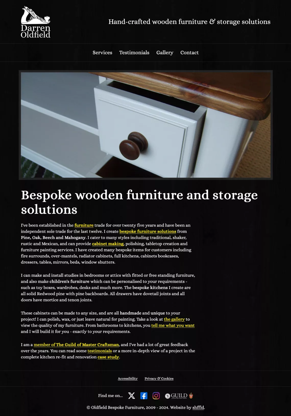
The first thing we looked at was to improve the accessibility of the colour scheme. The link colour and some hover/focus states were too subtle and didn't have enough contrast so we switched out the grey for a bright yellow.
The tweaked palette:
-
- Black
- #000
- rgb(0 0 0)
- hsl(0deg 0% 0%)
-
- White
- #fff
- rgb(255 255 255)
- hsl(0deg 100% 100%)
-
- Bright
- #fe0
- rgb(255 238 0)
- hsl(56deg 100% 50%)
-
- Tint
- rgb(255 255 255 / 0.1)
- hsl(0deg 100% 100% / 0.1)
Colour contrast
From an accessibility check, the scores for these colour combinations are much better than previously, and hit WCAG2 AAA standard as well as high contrast pass using the WCAG3 Advanced Perceptual Contrast Algorithm (APCA).
-
- Bright/Black
- Lc -94.6 / AAA 17.48
-
- Black/Bright
- Lc 94 / AAA 17.48
-
- Black/White
- Lc 106 / AAA 21
-
- White/Black
- Lc -107 / AAA 21
Layout and style
We updated a lot of the styles behind the scenes, improved the layout, made a few tweaks to font sizes, and did a couple of maintenance updates (like switching the Twitter logo out for the new X logo).
Updating body link colour to Bright makes the links really obvious, and much easier to read. We also updated how the menu works to have an active state as you move through the other pages, and updated the ARIA accessibility attribute aria-current="page" to mark the currently active page for assistive software.


From both a mobile and desktop perspective, the increase in font size makes the site feel much more approachable and easy to read.


We applied sensible Core Web Vitals recommendations to images across the board: for the slideshow on the homepage, we added fetchpriority="high" on the first image, and used a <link rel="preload" href="/img/slideshow/slide1.webp" as="image"> in the <head> of the page to give it the best chance of loading fast.
Across the board we ensured that every single image had a width and height attribute added with the image's correct intrinsic values (the size of the image file, not the size it appears on screen).
Any images that were low priority or likely off screen on initial page load were given a loading="lazy" attribute to allow the browser to defer fetching and loading those images until the more important tasks are done.
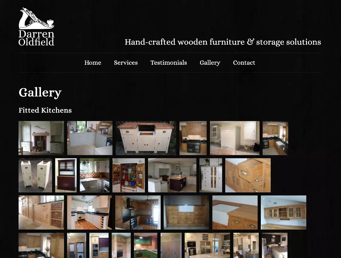
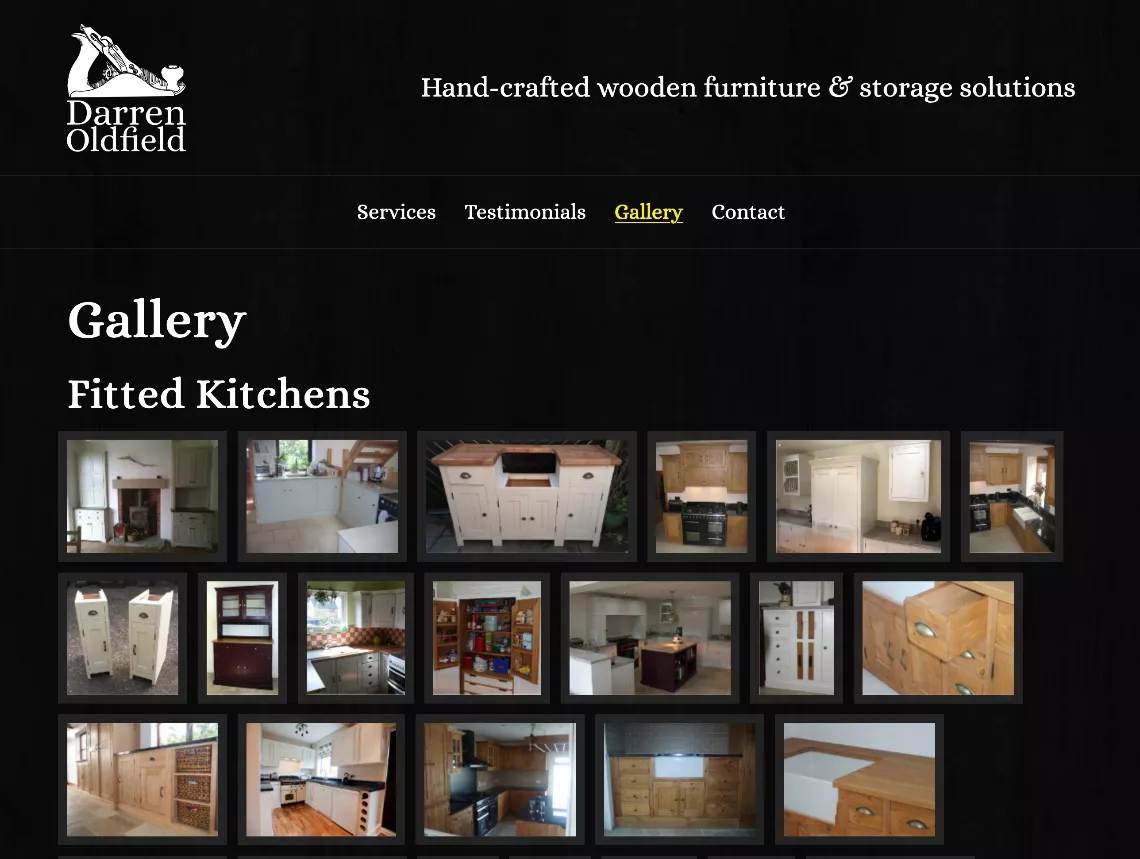
We applied the same semi-transparent border to each gallery image and increased the space around each item as well to mirror the style of the slideshow on the homepage.


Page weight
We ran every single image on the site through an optimiser/convertor and moved from JPG images to WEBP for the most part, hugely reducing file size with almost no visible loss in quality.
Removing one of the font families in use, using the serif font across the board and only serving WOFF2 font files also meant we saved another 95KB off the page weight.
Overall, we almost halved the entire size of the whole website during these updates:
Before and after comparison
Other improvements
We decided to split the gallery up into smaller, individual gallery pages and make the gallery landing page a gateway to the others to further decrease each individual page load time and weight.
The original gallery page was 1.41MB. Optimising the page got it down to around 897KB. We decided it was a better overall experience now that there was a large selection of images split into categories that creating a landing page to guide you to the images you're interested in and therefore splitting one gallery page into four smaller, lighter galleries meant that the landing page now weighs in at 237KB, the kitchens gallery is 496KB, fitted furniture is 340KB, other furniture is 428KB and the bedroom furniture gallery is 240KB.
The page weight for each site page is approximately 173KB for all base assets (CSS, JavaScript, header, footer and all images needed to make the default layout look right), so splitting the gallery up means that we're only loading a small amount of data per page (the largest gallery page was 330KB more than the base) which is less than 22% of the original gallery page size!
This is phenomenal! Converting images to modern formats, adjusting how some areas are built and function makes a huge difference in overall page weight and performance.
Core Web Vitals and page stats
Mobile (Previous version)
-
Largest Contentful Paint:
5.3s
Success: < 2.5s Warning: 2.6s - 4s Error: > 4s
-
First Contentful Paint:
0.9s
Success: < 1.8s Warning: 1.81s - 3s Error: > 3s
-
Speed Index:
0.9s
Success: <3.4s Warning: 3.5s - 5.8s Error: > 5.8s
-
Cumulative Layout Shift:
0
Success: < 0.1 Warning: 0.11 - 0.25 Error: > 0.25
-
Total Blocking Time:
0ms
Success: < 200ms Warning: 201ms - 600ms Error: > 600ms
-
Page weight:
1 MB
Success: < 1.5 MB Warning: 1.5 MB - 2.23 MB Error: > 2.23 MB
-
Performance: 81%Accessibility: 100%Best practices: 96%Search Engine Optimisation: 95%
Mobile (March 2024)
-
Largest Contentful Paint:
1.1s
Success: < 2.5s Warning: 2.6s - 4s Error: > 4s
-
First Contentful Paint:
0.9s
Success: < 1.8s Warning: 1.81s - 3s Error: > 3s
-
Speed Index:
0.9s
Success: <3.4s Warning: 3.5s - 5.8s Error: > 5.8s
-
Cumulative Layout Shift:
0
Success: < 0.1 Warning: 0.11 - 0.25 Error: > 0.25
-
Total Blocking Time:
0ms
Success: < 200ms Warning: 201ms - 600ms Error: > 600ms
-
Page weight:
483 KB
Success: < 1.5 MB Warning: 1.5 MB - 2.23 MB Error: > 2.23 MB
-
Performance: 100%Accessibility: 100%Best practices: 100%Search Engine Optimisation: 100%
Tech used
- Eleventy: static site generator
- PostCSS: for CSS niceties
- Gulp: For front end build tasks
- Image optimiser and convertor
Reyt good
Darren Oldfield Joiner, Carpenter, GentlemanThe first version of my site was built over a decade ago and it was the best thing I ever did for my sole trader business. I could show off my work and testimonials which brought in new leads for bespoke furniture and joinery projects.
At first I was apprehensive about getting a website sorted, but glad I did and that I got it built by someone who really knows what they are doing!
Shffld did a remarkable job, and continue to do so - and I have never looked back!
Proper loveleh as they say up here in Yorkshire. We hugely reduced the overall download size of each page, updated plenty of bits and improved accessibility as well in a few places. The Core Web Vitals scores are also improved so overall, we're feeling pretty chuffed.
Are you still here?
You've got staying power, that's for sure! Does your website say the same about you? Do you want a website that shows people you really mean business? Of course you do! I can help.