The project
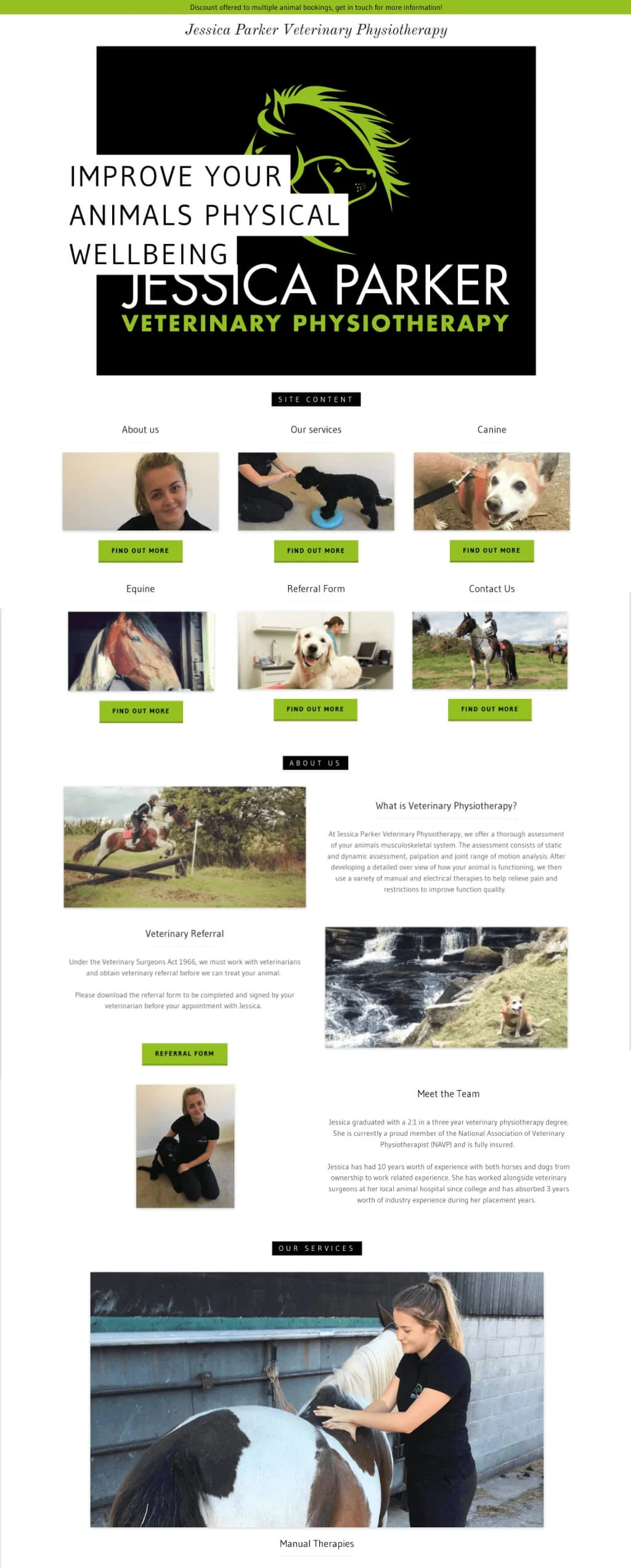
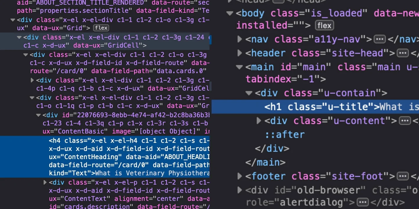
Jessica's previous website had been built using the GoDaddy site builder tool, and upon inspection we found that the code output was less than satisfactory (we'll cover this a bit later). The site wasn't great from an accessibility point of view, was not very quick to load and had layout issues on smaller screen devices.
The site had almost all the necessary content, but it took a while to get to the really important stuff - especially for visitors navigating via keyboard. I noticed that there were no considerations for Facebook Open Graph sharing data, nor Twitter Cards.
There were a couple of legal considerations too, in that there was no Terms and Conditions, Privacy Policy or Accessibility Statement pages or content at all. This was really important to resolve.
Our aims
- Re-prioritise and re-organise the content
- Improve smaller screen experience
- Improve site performance overall
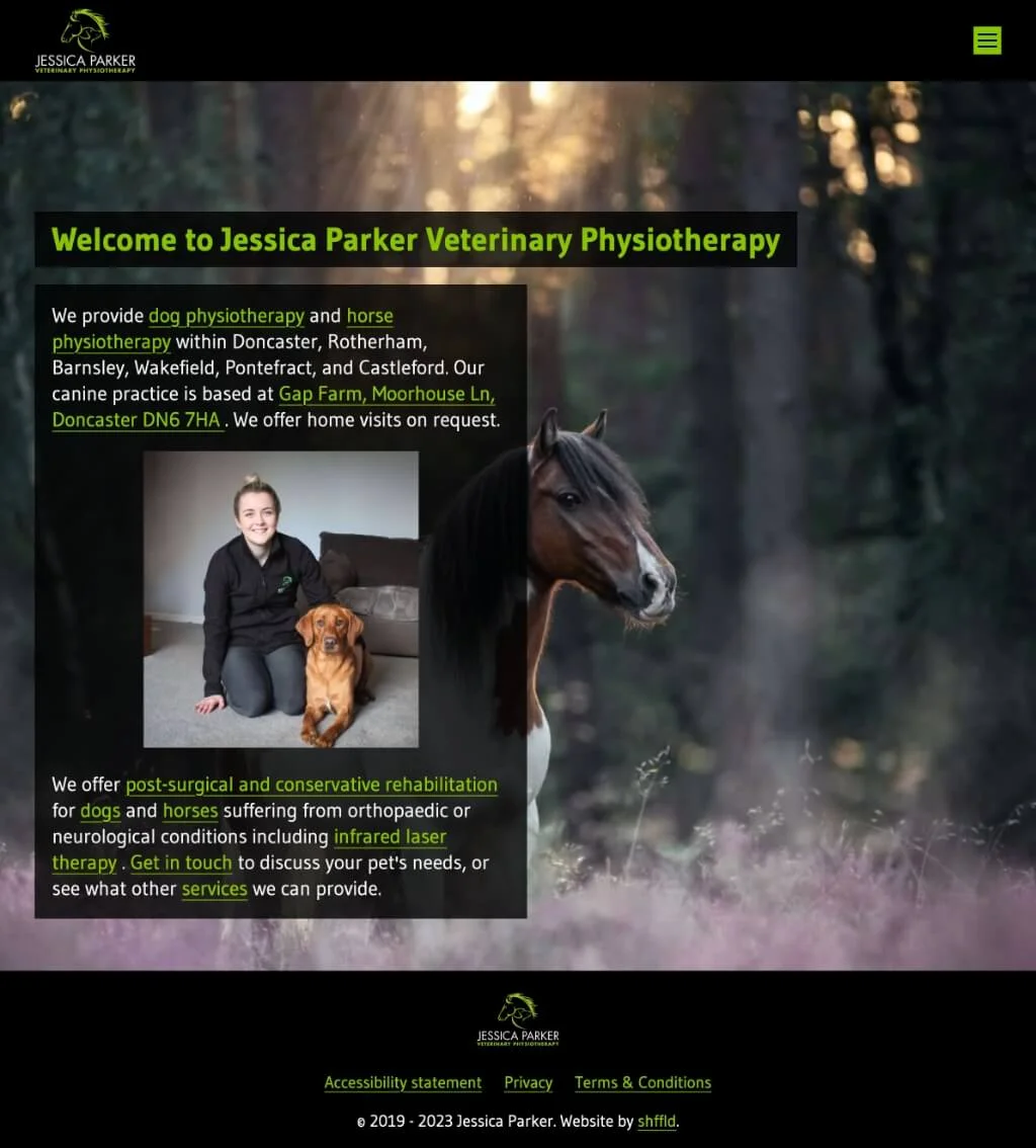
- Update the look and feel of the site
- Add missing social sharing metadata
- Add the missing content pages for legal bits and pieces
- Add new blog section
Colour palettes
-
- Apple
- #89c400
- rgb(137 196 0)
- hsl(78deg 100% 38%)
-
- Napier
- #02a213
- rgb(2 162 19)
- hsl(126deg 98% 32%)
-
- Black
- #000
- rgb(0 0 0)
- hsl(0deg 0% 0%)
-
- Grey
- #3e3e3e
- rgb(62 62 62)
- hsl(126deg 0% 24%)
-
- Wild Sand
- #f4f4f4
- rgb(244 244 244)
- hsl(126deg 0% 96%)
UX, UI and design
The previous website didn't have a navigation menu where you'd expect, and what did exist took up too much space and didn't really help visitors get to the important content quickly.
The first thing we did was introduce navigation as one of the very first things on the page, including Jessica's logo where most would expect it to be placed. This immediately brings the content much higher up, and allows the site to get to the point quickly. This massively improved the mobile experience of the site too, because you didn't have to scroll several screens to get to the real content of the page.


Whether you can see it or not, what's behind the scenes is really, really important. Imagine you hire a plumber to fix some pipes and they install 500 metres of piping between two points only a couple of metres apart.
Sure, the water will get there, but it's going to take longer than it should. It's the same with websites. Keeping your code behind the scenes as clean and uncomplicated as possible means you're using as close to those 2 metres of piping as you can possibly get!


Not only will the site render quicker (less energy used by your web browser to paint your site onto the screen), but it'll likely also be more accessible (more people can use it on a broader range of devices and screen sizes!), more semantic (it's done properly, and to the correct standards) and generally easier for other web developers to understand too!
Performance
We ran a few Page Speed Insights tests on the new site, and found that page performance increased by at least double on desktop, and by more than 25% mobile/tablet.
The previous site was slow to 'get going' and scored low on these tests. Our much improved results, in part, are because we'd slimmed down things behind the scenes, making sure only the things we know we'd need were there.
Think about how often you leave a website because it's taking too long to load - this is so important to remember. If your site performs that badly, will anybody stay long enough to see if your content is even worth reading?

There are other technical considerations here too though, such as:
- Compress images sensibly; smaller filesizes mean quicker load times!
- 'Minify' code where possible; removing all whitespace means it's less readable to humans, but just as easy to web browsers and results in smaller filesizes
- Removing any requirement for a database; If you don't have to query a database, you don't have to wait as long for the page to load!
I think it's fair to say that the results speak for themselves!
Core Web Vitals
Desktop (March 2024)
-
Largest Contentful Paint:
0.4s
Success: < 2.5s Warning: 2.6s - 4s Error: > 4s
-
First Contentful Paint:
0.2s
Success: < 1.8s Warning: 1.81s - 3s Error: > 3s
-
Speed Index:
0.2s
Success: <3.4s Warning: 3.5s - 5.8s Error: > 5.8s
-
Cumulative Layout Shift:
0.082
Success: < 0.1 Warning: 0.11 - 0.25 Error: > 0.25
-
Total Blocking Time:
0ms
Success: < 200ms Warning: 201ms - 600ms Error: > 600ms
-
Page weight:
198 KB
Success: < 1.5 MB Warning: 1.5 MB - 2.23 MB Error: > 2.23 MB
-
Performance: 99%Accessibility: 95%Best practices: 100%Search Engine Optimisation: 91%
Tech used
- Astro: static site generator
- Sanity: headless CMS
- PostCSS: for CSS niceties
- Gulp: For front end build tasks
Pretty chuffed
We're pretty chuffed with how this first version of Jessica's site has turned out. Not only that, but Jessica is also super happy with it too! It's faster, sleeker, works better on mobile and is far more accessible to visitors.
I wanted a website that would stand out against my competitors and Shffld did just that! I love how my company image is continued throughout making it professional and easy to use.Jessica Parker
There's always more to be done, and we'll be working closely with Jessica to work out where we go from here and how we can continue to improve the site and help potential new customers get what they want quickly.
Are you still here?
You've got staying power, that's for sure! Does your website say the same about you? Do you want a website that shows people you really mean business? Of course you do! I can help.